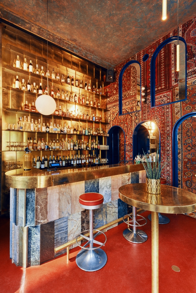
aura bar | warsaw 2019 | photography by Łukasz Kuś, staged by Magda Rzeszot
Aura is set on the ground floor of a former tenement house of Jochwet Taubenhaus that was built in the 19th century in the very center of Warsaw and has survived German bombings during Second World War. There has been several kinds of business ran in the small corner premises on the ground level of the building since then - all left some history in the walls which we wanted to evoke. Traditionally this kind of location is specific to the minor crafts services so my idea was to make as much of custommade solutions as possible. Upholstery was made by the craftsman next door, and brass details were also executed on spot while stone slabs cladding the bar come from a stonemason based on one of Warsaw cementaries and are the leftovers of his commisions. That brings also a scent of spirituality to the design! We also used polish lighting brand Chors to illuminate the bourbon display and finally one of this would be possible without our local and very dilligent general contractor. [Text continues below...]
The name of the bar relates to latin aurum-gold and also to a colour of bourbon based cocktails served here (Woodland Reserve is a leading brand). I contrasted polished and mat, veneered and raw brass with soft and tactile carpets cladding the wall, original, raw materials and modern finishings. To make advantage of a relatively small space a set of holes was designed in the floor making possible several combinations of custom made high, low, big and small tables. Behind the carpet wall there is a supply area and cobalt blue toilet. Together with investors I tried to make out how people would use the place in the daytime, evening and by night keeping in mind natural lighting conditions and the downtown location. We came up with few sets of tables dedicated to specific time of the day and people flow and provided dimmable light to transform the place from a daily cafe to a coctail bar or even a small concert venue. I therefore had to adjust the set of holes in the floor according to existing 19th century layout of steel supporting beams and yet obtain ergonomic distances between fixed tables and stools and benches.
The colour scheme was somehow obvious - brass corresponding well with the colour of drinks and carpets and a pinch of cool cobalt blue to brake yet underline this scheme. And in contrast to the bar - the interiors of the bathroom are dark and blue.


